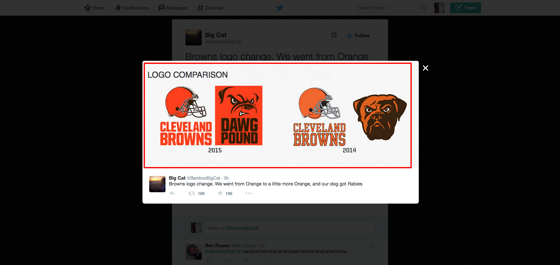
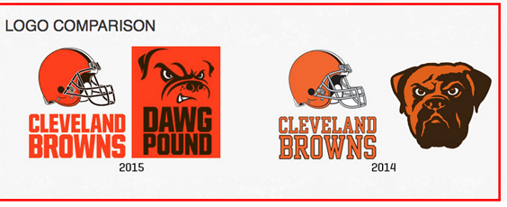
In a serious marketing attempt to update their brand, which included serious quotes such as, “The orange is brighter and richer and matches the passion of our fans and city…the new brown facemask represents the strength and toughness of Cleveland,” the Cleveland Browns added some paint to their helmets and sort of maybe changed the dog. Its a fail and the Twitter fallout has been epic.
BREAKING: New Cleveland Browns logo revealed pic.twitter.com/Dig4FXI2NX
— Shooter McGavin (@ShooterMcGavin_) February 24, 2015
Gamechanger: Cleveland Browns Unveil New Logo. http://t.co/GCtH7aFWyi pic.twitter.com/RVrvMWew7R
— VICE Sports (@VICESports) February 24, 2015
What if the Cleveland Browns redesigned *EVERY* NFL team's logo?http://t.co/mjAQywEMEP pic.twitter.com/OirlcXdPuN
— SB Nation (@SBNation) February 24, 2015
Whenever I see a story about the Cleveland Browns, I think about this http://t.co/Hcr0Ob5zHg pic.twitter.com/nXwn9lzMha
— (((JonathanSinger))) (@jonathanhsinger) February 24, 2015
The Browns’ new logo in a nutshell pic.twitter.com/8GfPmAxYxz
— SportsNation (@SportsNation) February 24, 2015
Seeing new Browns' logo reminded me of this scene from Not Another Teen Movie: Janey's Transformation: http://t.co/LyokG5VCtE via @YouTube
— Lynn Hoppes (@lhoppes) February 24, 2015
Hey look, I just made the #browns new logo in paint!!! Only took 25 seconds pic.twitter.com/ZLxvY14H0x
— Kevin J. Chmura (@KJChmura) February 24, 2015


